Health inequalities narrow even as they widen
Latest data on mortality for common causes of death, published today, show progress on meeting most of the Department of Health mortality targets. But the way some of those targets were framed made success almost inevitable.
Deaths from circulatory disease, cancer, and suicide have all declined and should meet the targets set for 2010. That’s fine.
But doubts emerge when we look at the targets for reducing health inequalities in mortality rates. The absolute gaps between richer and poorer areas have indeed fallen, more rapidly for heart disease than for cancer.
But here’s the puzzle. Let’s take deaths from circulatory diseases. Since the baseline year of 1995-97, deaths across England as a whole have fallen from a three-year average of 141.3 per 100,000 to 74.8 per 100,000. In the Spearhead group of PCTs (a group that is in the bottom fifth for at least three out of five criteria: life expectancy for men and women; cancer and cardiovascular mortality; and deprivation) the fall has been from 178 to 97.4.
In percentage terms, cardiovascular deaths have fallen by 47.1 per cent in England as a whole, but by slightly less (45.3 per cent) in the Spearhead Group. Deaths are falling more slowly in the disadvantaged areas. How, then, can the DH claim that the gap is narrowing?
By measuring it as an absolute gap in the rates. As the rates are falling everywhere, this gap is almost bound to narrow in absolute terms, though as a percentage it is actually widening. The absolute gap has indeed declined, from 36.7 in the baseline years of 1995-97, to 22.6 in 2006-08 – against a target of 22.0. See the Table:
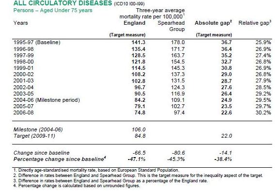
The DH can thus claim that the target has been met, even though the relative gap has increased, from 25.9 per cent to 30.2 per cent. One could paraphrase this as: “The gap between rich and poor in cardiovascular mortality used to be 26 per cent. Now it’s 30 per cent. So we’ve met our targets for narrowing it.”
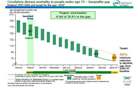
The graph below is another way of displaying the same data. All circulatory deaths have declined sharply, so a smaller gap is actually larger, proportionately.
In cancer, the same is true. Deaths overall are down by 19.3 per cent, but in the Spearhead areas the decline is slower, 18.2 per cent. The relative gap has widened from 14.7 per cent to 16.3 per cent. Yet the target, a reduction in the absolute gap by 6 per cent, has been achieved.
These inequality targets were so constructed that as long as deaths overall were falling, they were certain to be met. The process is roughly like saying that if we halved everybody’s earnings tomorrow, the absolute gap in incomes between rich and poor would narrow. Of course it would.
When the target regime started, cancer and circulatory deaths were already falling. In the case of heart disease, the trend had been apparent for at least 20 years. So it was a safe bet to set targets that would be met without much effort, so long as these trends continued. From this it followed mathematically that absolute gaps between rich and poor would also narrow, even if the poor did relatively worse – as they did.
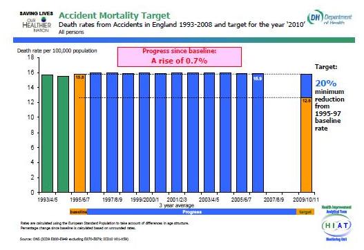
However, even the ingenuity of the target-setters can’t pretend that deaths from accidents are going to meet their target – a cut of 20 per cent by 2010. They show one of the flattest trend lines I’ve ever seen, barely varying for each three-year period and finishing 0.7 per cent higher than they were in 1995-97. “If the trend of the last ten years were to continue, the target would not be met” the DH acknowledges.