Getting your VAT in a graphical twist
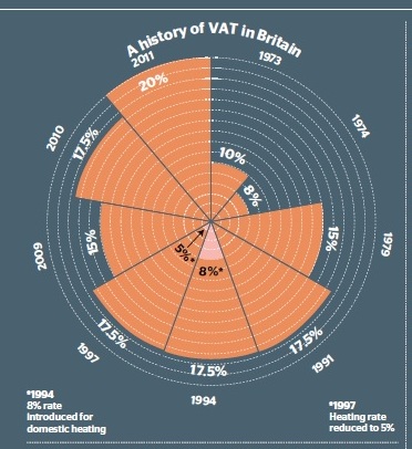
The website Understanding Uncertainty has nominated this graphic from The Times (4 January 2011) as a contender for the worst graphic of the year.
January 4 is pretty early in the year for submitting an entry into this hotly-contested competition, but I think they may be right.

It’s a new twist on the old graphic artist’s trick of misrepresenting numbers by using them as the radius of a circle. What the eye perceives is the area of the circle (or in this case quadrant) not its radius.
That’s bad enough, but this time the error goes even further (unless I’m missing something). VAT in each time period is plotted on a scale running outwards from the centre in which each division represents 2 per cent. That is the rule applied to 8 per cent, the rate in 1974, which occupies four divisions.
But 10 per cent (the 1973 figure) occupies six divisions, so actually represents 12 per cent, and the same applies to all the other figures. (15 per cent is drawn at the 22 per cent line, 17.5 per cent at the 26 per cent line, and 20 per cent at the 32 per cent line.) An arrow indicating 5 per cent, the heating rate in 1997, actually points to a value of 2 per cent.
The combination of these two errors means that the area occupied by 8 per cent is actually 16 times smaller than the area occupied by 20 per cent. An increase by a factor of 2.5 has been depicted as an increase by a factor of 16. Good going! Similarly, the change from 17.5 per cent to 20 per cent has been represented as more than 40 per cent, rather than the 14.3 per cent it actually is.
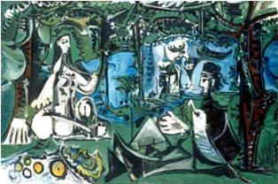
Understanding Uncertainty speculates that the artist responsible was inspired by Florence Nightingale’s famous “rose” diagrams. There was a BBC Four Four documentary in December which featured these diagrams, so it's certainly possible. If so it’s a tribute about as faithful to the original as is Picasso’s Dejeuner sur l’herbe to Manet’s original.
Here are those two famous pictures to remind you.

Manet's Dejeuner


Martin (not verified) wrote,
Fri, 21/01/2011 - 15:49
Nigel, I think the scale is actually 1 percentage point per division, but for some reason the scale starts at 4%!