Cod Statistics
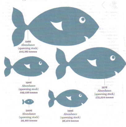
Here’s a pretty graphic from the Financial Times Weekend Magazine (page 14, June 6/7 2009) illustrating the decline in the spawning stocks of cod between 1966 and 2006. It looks good, but it’s an example of one of the oldest tricks in the graphic artist’s handbook: how to make a comparison between sets of figures look far more impressive.

The stocks are shown in the shape of fish, and the natural assumption of anybody looking at it is that the areas of each fish represent the size of the cod stocks at that moment in time. Except that they don’t.
What the artist has done is to represent the stocks by the length of each fish. This is, in effect, a bar chart laid on its side. Compare the fish representing 1966, when stocks were estimated to be 213,361 tonnes, to the one representing 1986, when stocks were 109,156 tonnes. It’s just under twice as long, showing that we are meant to read the length of these fish as representing stock levels.
But that’s not what the eye sees. Because the bigger fish is twice as long, it’s also twice as broad – so its area is four times that of the smaller fish. If you like to imagine the fish having three dimensions, as real fish do, then the bigger one is also twice as thick – that means it’s eight times the volume of the smaller one.
So what’s happened here is that a graphic intending to show a halving of fish stocks between 1986 and 1966 actually appears to show they declined by a factor of four – or eight, if you think of the fish as having three dimensions.
There’s nothing new about this method of presentation. It was described in Darrell Huff’s book How to Lie with Statistics as long ago as 1954. More recently, it was used by J.P.Morgan to misrepresent the decline in the market capitalisation of banks since the credit crunch began.
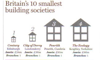
One might have thought the FT was above such things. But clearly not: in the very same issue of the Weekend Magazine (page 33) it uses exactly the same technique to show the assets held by the UK’s 10 smallest building societies.


