Mixed messages on inequality
In the midst of an election campaign it’s inevitable that various long-term statistics will be coming out of the woodwork.
The Conservatives will try to convince us that Labour has made a mess of Britain since 1997 and the Labour Party will be no less vocal about everything it has achieved since taking power from the Tories in the same year.
Whatever the reality, we can be certain of one thing: the statistics will be extremely involved. Long-term trends for poverty and income inequality are a prime example of this.
The first page of the Conservative draft manifesto chapter on education presents the case for Britain’s ‘broken society’ by claiming that “the number of people living in severe poverty has risen by 900,000 in the past ten years.”
Where exactly this figure of 900,000 comes from is unclear. Equally, and maybe the biggest problem with this claim, “severe poverty” is undefined.
A quick look at Labour’s claimed list of achievements since 1997 shows the difficulty with measuring poverty. The claims “900,000 pensioners lifted out of poverty” and “500,000 children lifted out of relative poverty” are listed as their eleventh and twelfth achievements in a list of fifty. It’s difficult to see how both parties can be right.
Some of the most reliable measures of poverty and income inequality are based the DWP’s Households Below Average Income (HBAI) series. Income is measured after income tax, National Insurance contributions and council tax. All incomes are scaled or ‘equivalised’ to take into account the different sizes and needs of households.
Analysis by the Institute for Fiscal Studies (IFS) of data from 1996-97 to 2007-08 shows that people in all income quintile groups of the population have experienced income growth in the region of 1.6-2.0 per cent. See the table below for a comparison across the Thatcher, Major, Blair and Brown years.
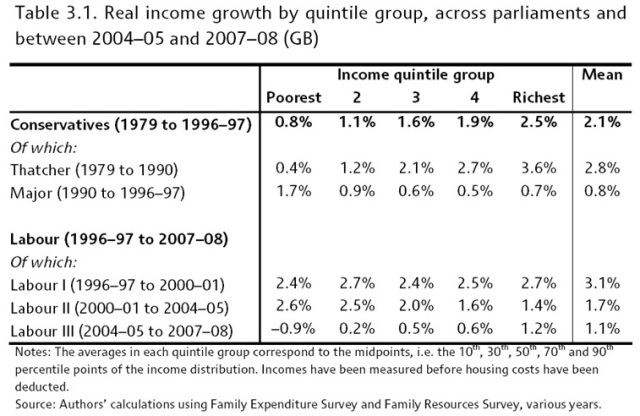
Looking at the table, it is clear that Labour has been better at distributing fairly the real income growth across all income quintile groups. The difference in income growth between the poorest quintile and the richest quintile under the Thatcher government (a difference of 3.2 extra percentage points for the richest) is stark. But in those days the Conservatuives never claimed to be in the business of creating equality.
The following graph is a clearer representation of the difference between the Conservative and Labour record on income inequalities. The trend line shows the Tory performance from 1979 to 1997 and the bars show Labour’s since 1997.
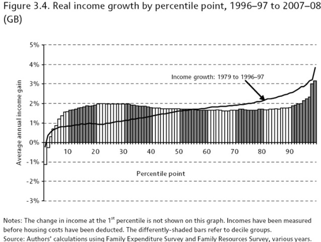
This graph breaks down income growth into percentiles as opposed to the more blurring quintiles above. Although overall it may present a better case to show how well Labour has done to reduce income inequalities, it presents a stark picture of how poorly Britain has done in general to reduce income inequalities since as far back as 1979.
With the added detail of the bottom ten percentiles, it’s clear that Labour hasn’t prevented a massive gap opening in the level of growth between the bottom ten percent and top five percent of households in Britain. That the poorest households have actually seen negative growth or growth significantly lower than most others fundamentally undermines the aims of achieving income equalities.
That said, the relatively higher proportions of income growth from the tenth to the fiftieth percentile compared to everyone above the fiftieth percentile under Labour shows a much better record on income equalities than eighteen years of Conservative efforts.
Excluding the extremes, the pattern of income growth under Labour is almost the complete opposite to the trend under the Conservatives which saw higher income growth for households in higher percentiles.
One of the most worrying trends for Labour and Britain, however, must be those in the following graph. The graph plots the income growth by income percentile group for each of Labour’s three terms.
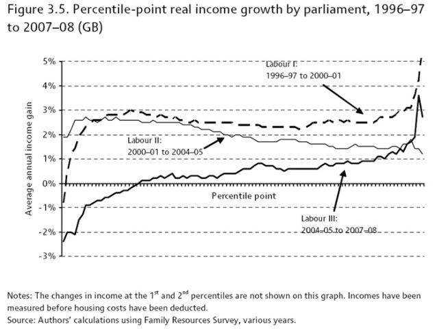
The first term seems to be relatively successful. Excluding the bottom ten percent and top five percent, average income growth seems to be slightly higher among the lower percentiles although remains mainly consistent.
The second term seems to be the Goldilocks scenario. Apart from the very bottom two or three percentiles, the average annual income gain is higher the lower the percentile of the household. At any rate, the lowest percentile grew more than the highest which closes the inequality gap.
The third term is where alarm bells start ringing. The trend looks very similar to, if not worse than, the Conservative record plotted in Figure 3.4 (the graph above this one). Not only is income growth lower for the lower percentiles, for around the bottom twenty percentiles, average income growth is actually negative – something even the Conservative Party can’t be accused of despite its otherwise poor record.
In the current climate, an immediate Labour defence might be to point the finger at the global financial crisis. This will certainly carry some truth. However, it is equally true that a global financial crisis would affect the top-income percentiles most as their incomes are most connected to interest rates and financial markets.
At the moment it’s difficult to call just who and how the recession will affect Britain in terms of income inequalities. The IFS states clearly:
Muriel and Sibieta (2009) illustrate how inequality evolved during previous UK recessions, and make clear that there is no ‘rule’ for the behaviour of inequality during a downturn. Inequality fell during the recession of the mid-1970s, rose during the recession of the early 1980s and was more or less unchanged during the recession of the early 1990s. Clearly, history offers little guide as to what we can expect to happen to inequality during the current recession.
Looking at the Gini Coefficient, a more direct measure of income inequality, it’s possible to see how much income inequality has grown over time. (The coefficient ranges from 0 to 1, 0 being no inequality and 1 being absolute inequality). The graph below again plots income inequality trends from the start of the Thatcher government.
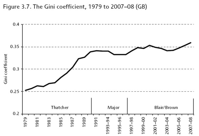
This separate measure seems to reaffirm the difference in the two parties’ records on reducing income inequalities. Neither has succeeded in significantly lowering them although Labour seems to have done better at keeping them under control. However, if the latest trends continue, it’s not unreasonable to assume that we might see another rapid growth in inequalities as we did at the end of the Thatcher years.
Going back to where we started: measuring poverty and income inequalities isn’t a simple case of ‘counting victims’. 900,000 more people in severe poverty could well be a very fair figure – just looking at extremes of the bottom percentiles in any of the data above would affirm that.
In addition to using simple statistics as facts, there’s a lot to be said for looking at the long term trends and the soft facts based on education, health, benefits and social mobility.
Vague statements such as “severe poverty” aren’t particularly helpful either, especially when they conjure up images of “extreme poverty”, which the World Bank defines as people living on less than $1.25 per day.
But the real problem for David Cameron when he criticises Labour's record on inequalities is that of his own party's history. While Conservatives of the generation of Harold Macmillan may have had a vague committment to narrowing social gaps, that was never part of Mrs Thatcher's philosophy. She gloried in rewarding the successful. Yet he dare not repudiate her legacy. He is caught in an awkward dilemma best escaped by not saying too much about inequality. The 900,000 claim may turn out to have been a mistake, whatever its so-far undisclosed origins.
And if Britain really is broken, the cracks won’t be so simple.

Anonymous (not verified) wrote,
Wed, 14/04/2010 - 07:54
Good article. Thanks.
Is the Gini coefficient a good way of measuring inequality in one number, or does it have any criticisms? It would be interesting to see the Gini graph with a few other countries or OECD/G7/G8/EU plotted, to see if there is a global trend that the UK is part of, or if the UK is following its own path.